BRIDGE THE GAP
WEBSITE DESIGN FALL 2022
DESCRIPTION
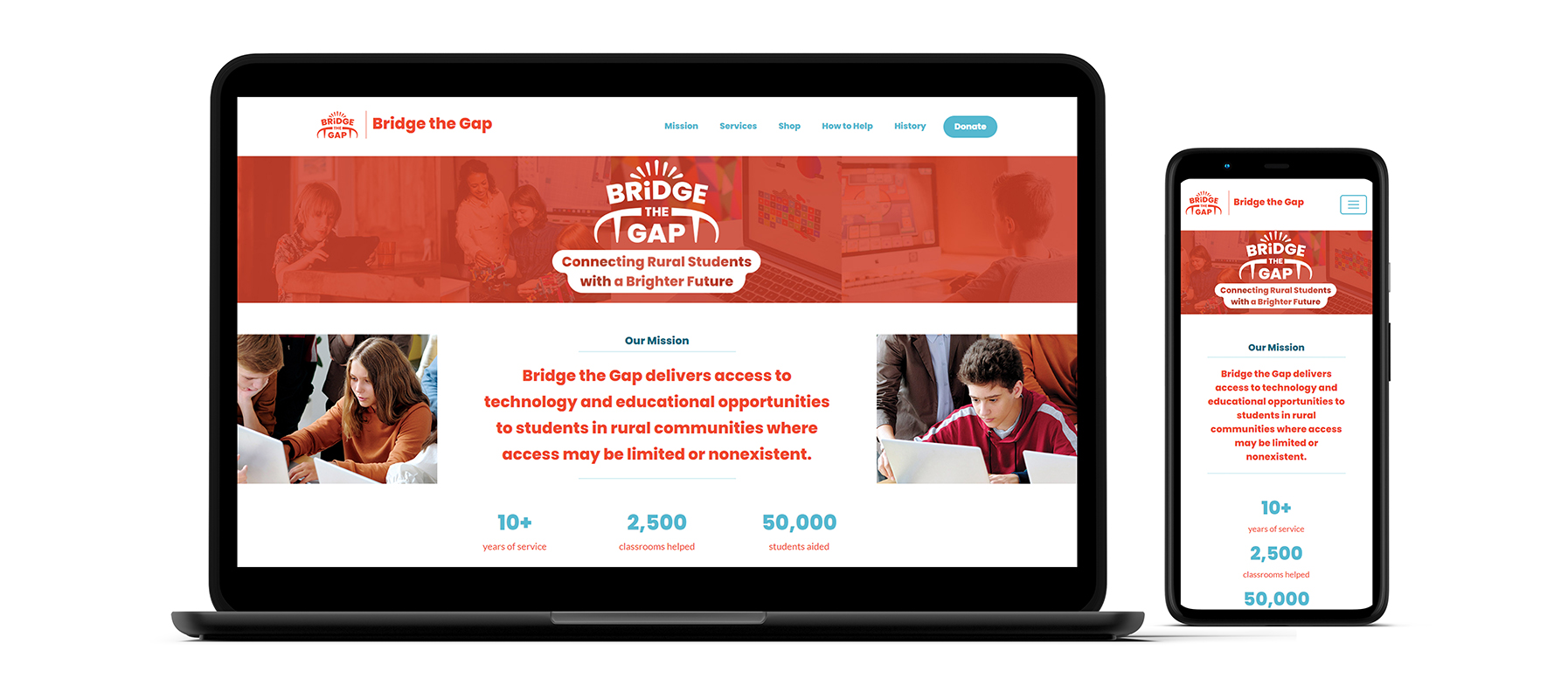
This one-page website is for the conceptual non-profit organization Bridge the Gap (BTG). BTG
provides rural communities with technology and educational opportunities. The website is a
resource for users to learn about the organization, donate, shop, request help,
and more.
The development of the website began with the creation of a sitemap and style tile. Three
personas, representing a young student, a parent, and a teacher who are primary and secondary
users of the site, were also created to drive the website’s design and content. The website was
built in the Bootstrap 5 framework. It is responsive for viewing on desktops and
mobile devices.
The website features a collage of photos with students utilizing BTG’s technology, with the
organization’s logo and mission statement overlaying as a hero image. Additionally, the mission
statement is prominently displayed within the first fold, as well as a list of statistics about
the organization’s impact. The site’s navigation contains the logo, a list of navigation links,
and a donate button, placed so that users have multiple easy places to access the
donation portal.
A list of the organization’s services is placed within card tiles showing a playful icon, a
heading, description, and a call to action. The Shop section, which shows Bridge the Gap’s most
popular merchandise items, complete with a photo, name, short description, price, and a call to
action. The remainder of the page contains helpful information, prominent buttons, icons, and
colorful photos to add visual interest. The footer has a link to navigate to the top of the
page, a repeat of the navigation bar, contact information including social media, and
legal information.
The imagery is consistent with BTG’s branding, using the same fonts, color palette, photos,
icons, and pattern. The site is playful, inviting, and accessible for young people and those
with low computer literacy. Large, descriptive buttons, clearly separated sections, and multiple
ways to navigate make the site easy to explore. Color contrast and alt tags on every image also
increase accessibility. The site is also SEO optimized, with a meta description and proper heads
and paragraph structure.
FINAL DESIGN
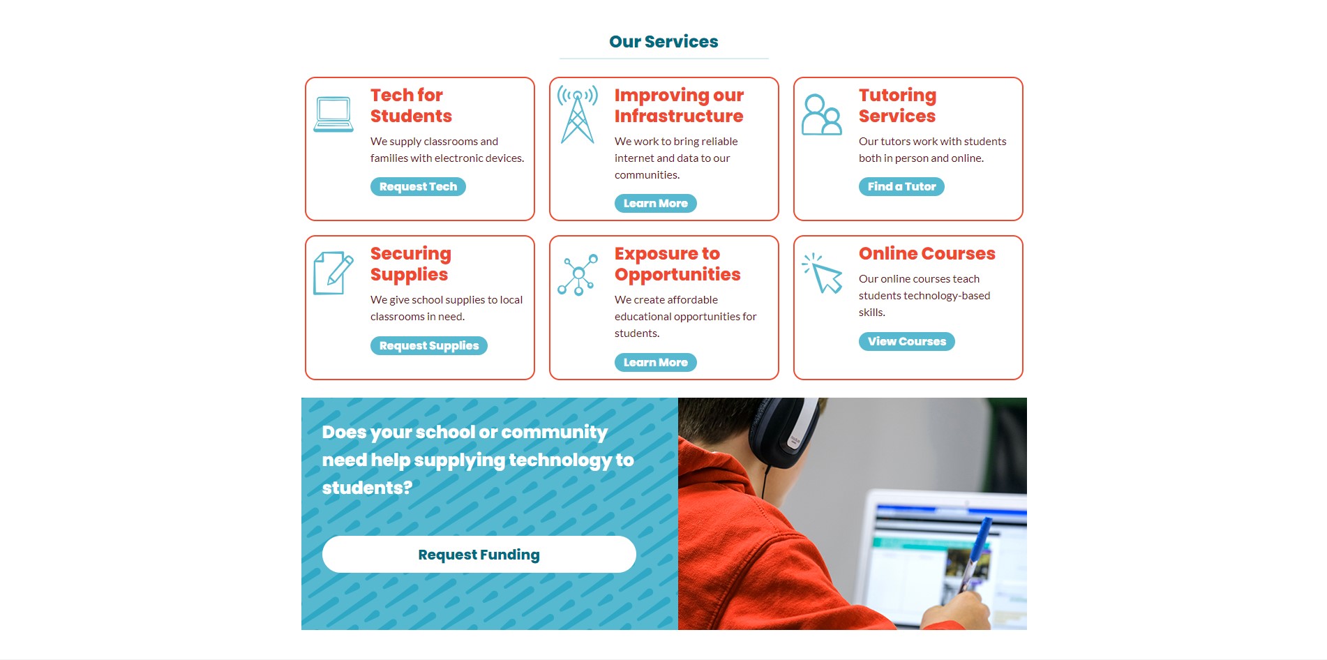
Services Section Still
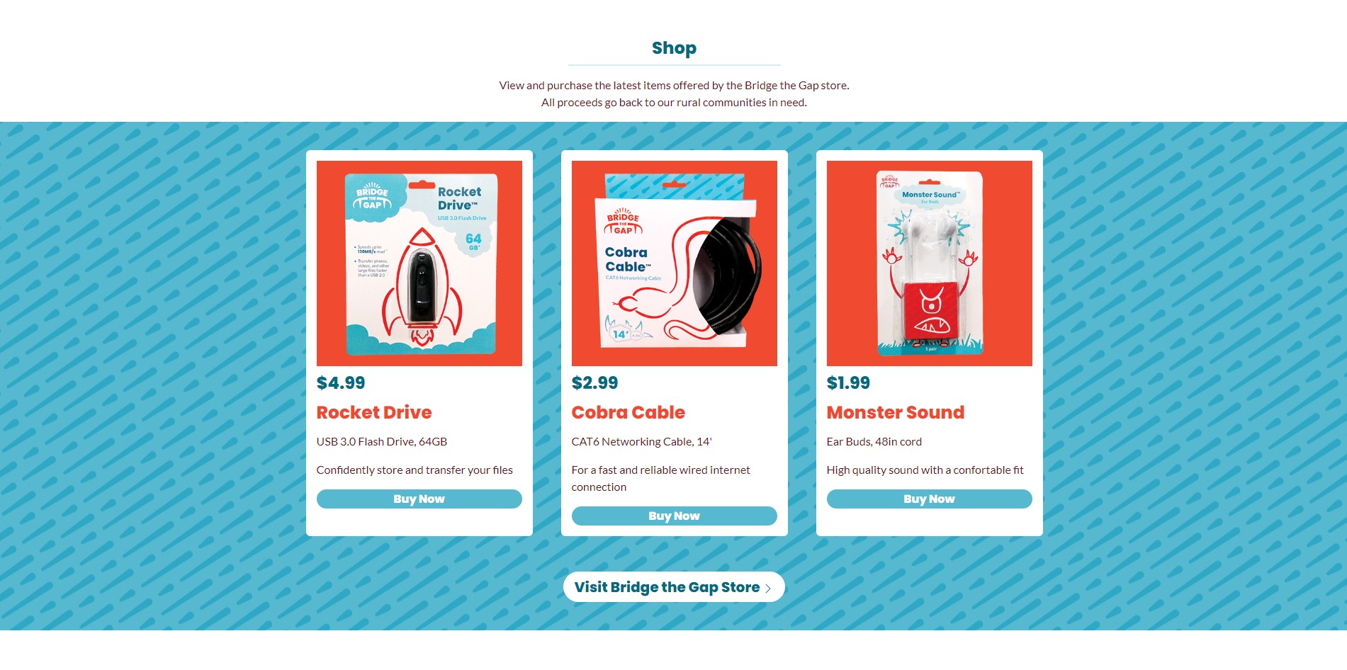
Shop Section Still
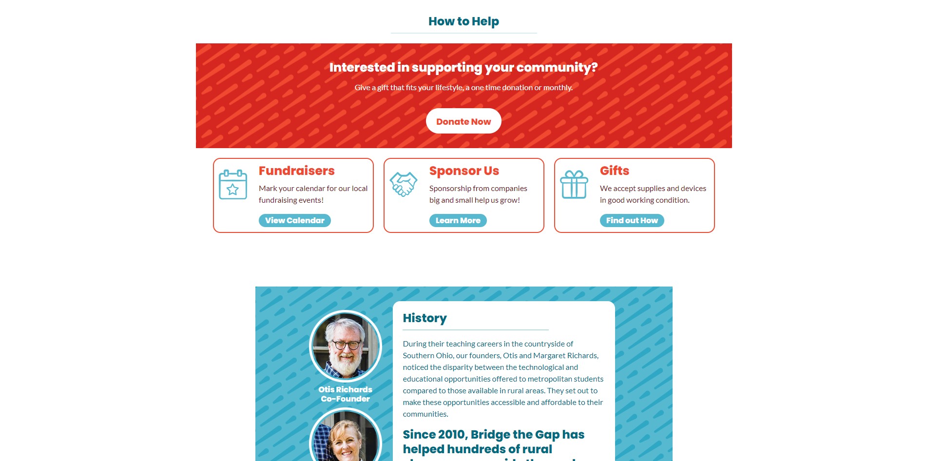
How to Help Section Still
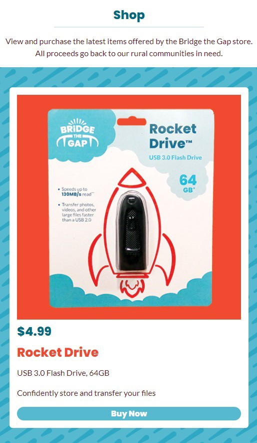
Shop Section Mobile Still
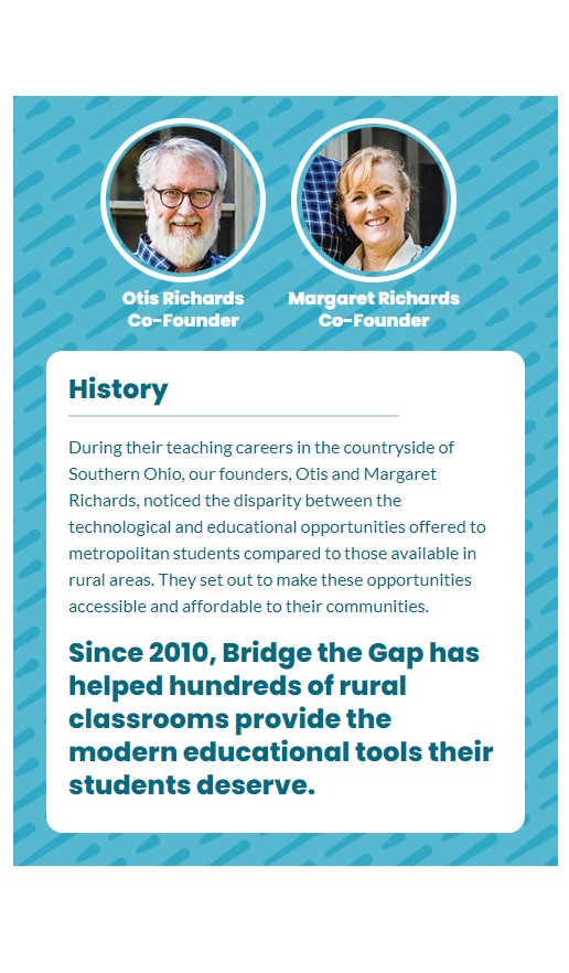
History Section Mobile Still