CLEVELAND CRYPTWALKERS
BRAND IDENTITY SYSTEM & GUIDELINES SPRING 2023
DESCRIPTION
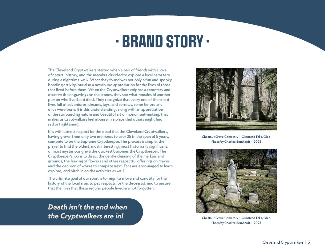
The Cleveland Cryptwalkers (CC) is a conceptual cemetery exploration enthusiasts’ group that
participates in competitive grave identification and cemetery cleanup games. The group’s values
include fascination with the history and aesthetics of cemeteries and respect for the dead. The
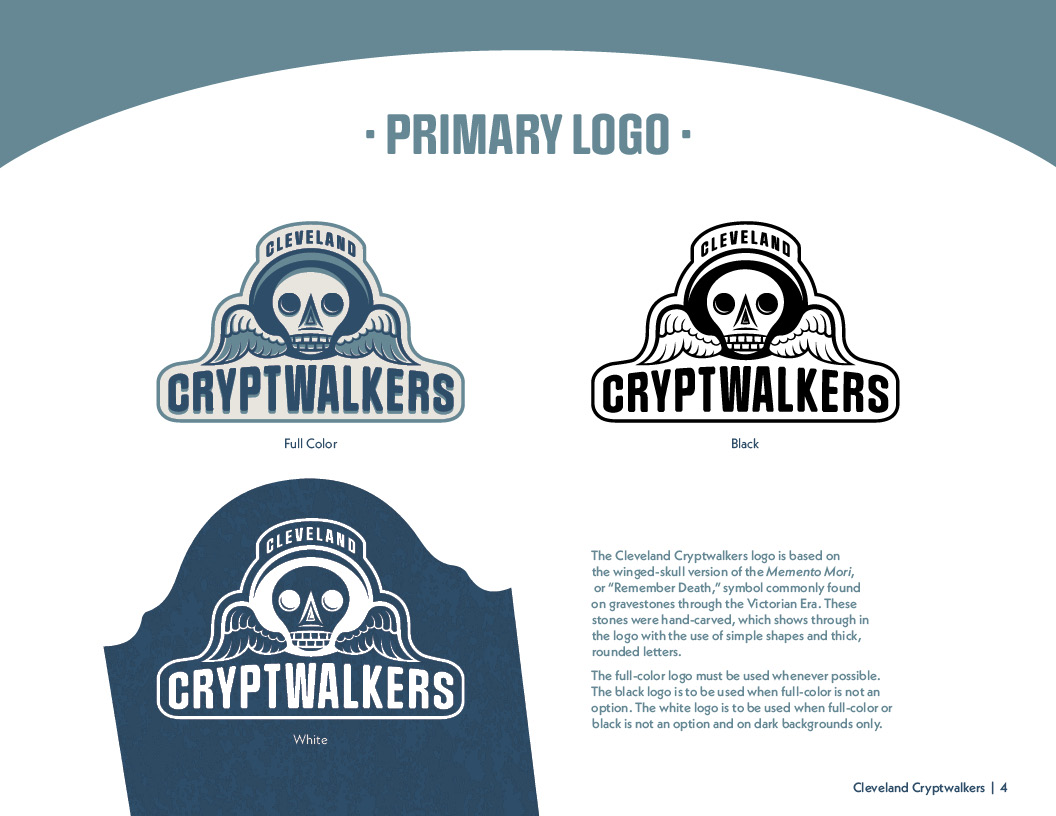
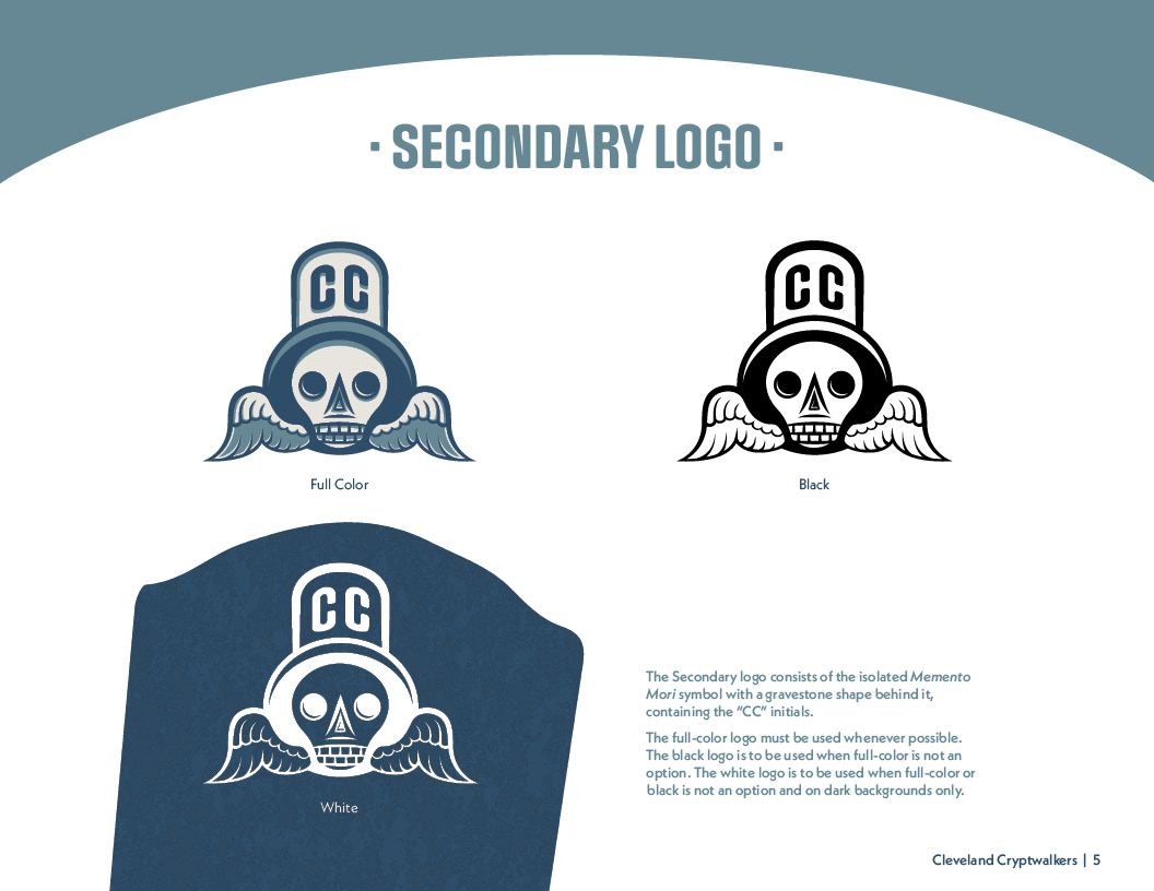
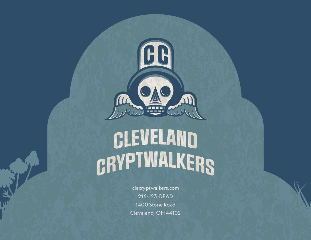
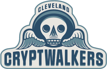
CC logo reflects the history of cemeteries, depicting a winged-skull version of the “memento
mori” symbol commonly found on graves through the 18th century. These stones were hand-carved,
which is reflected in the logo by the use of simple shapes, thick, rounded letters, and ample
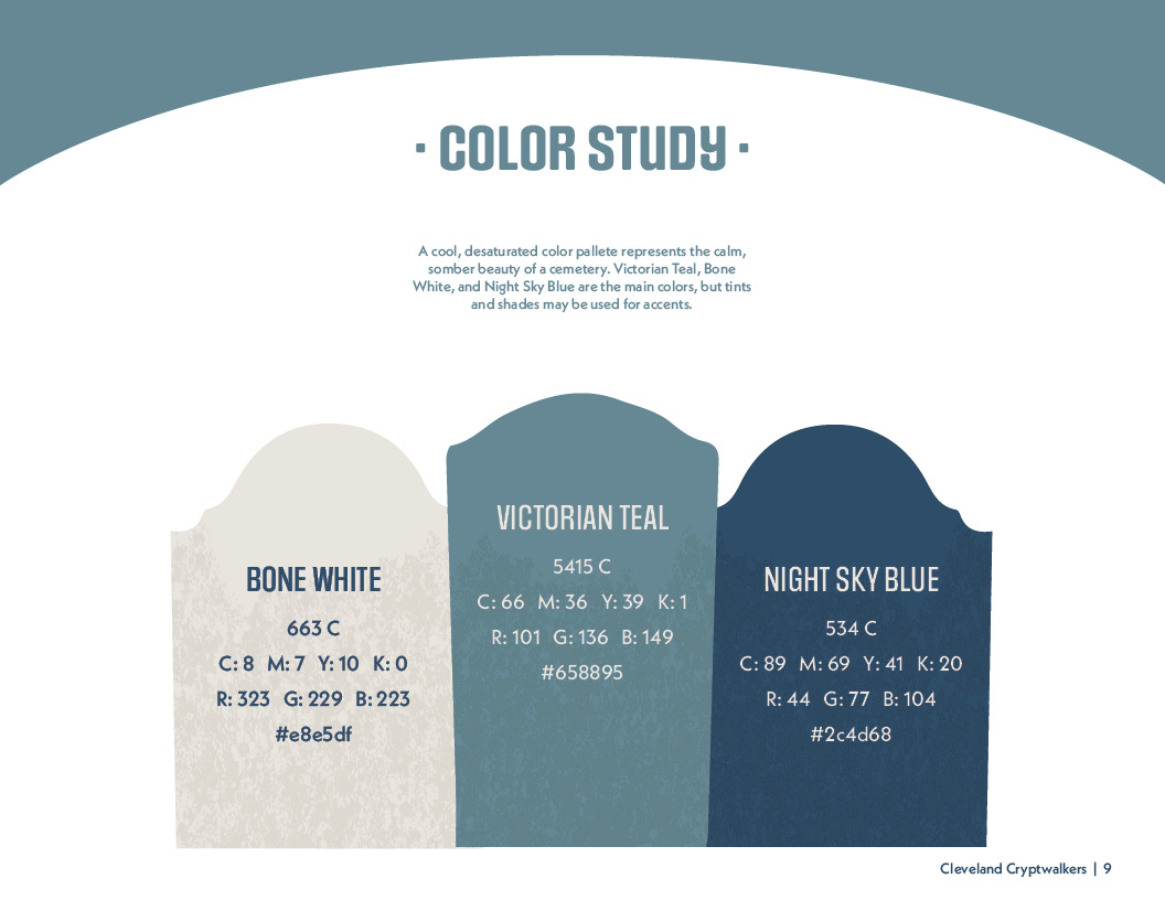
shading. The colors are cool and desaturated blues and creams, representing a cemetery’s calm,
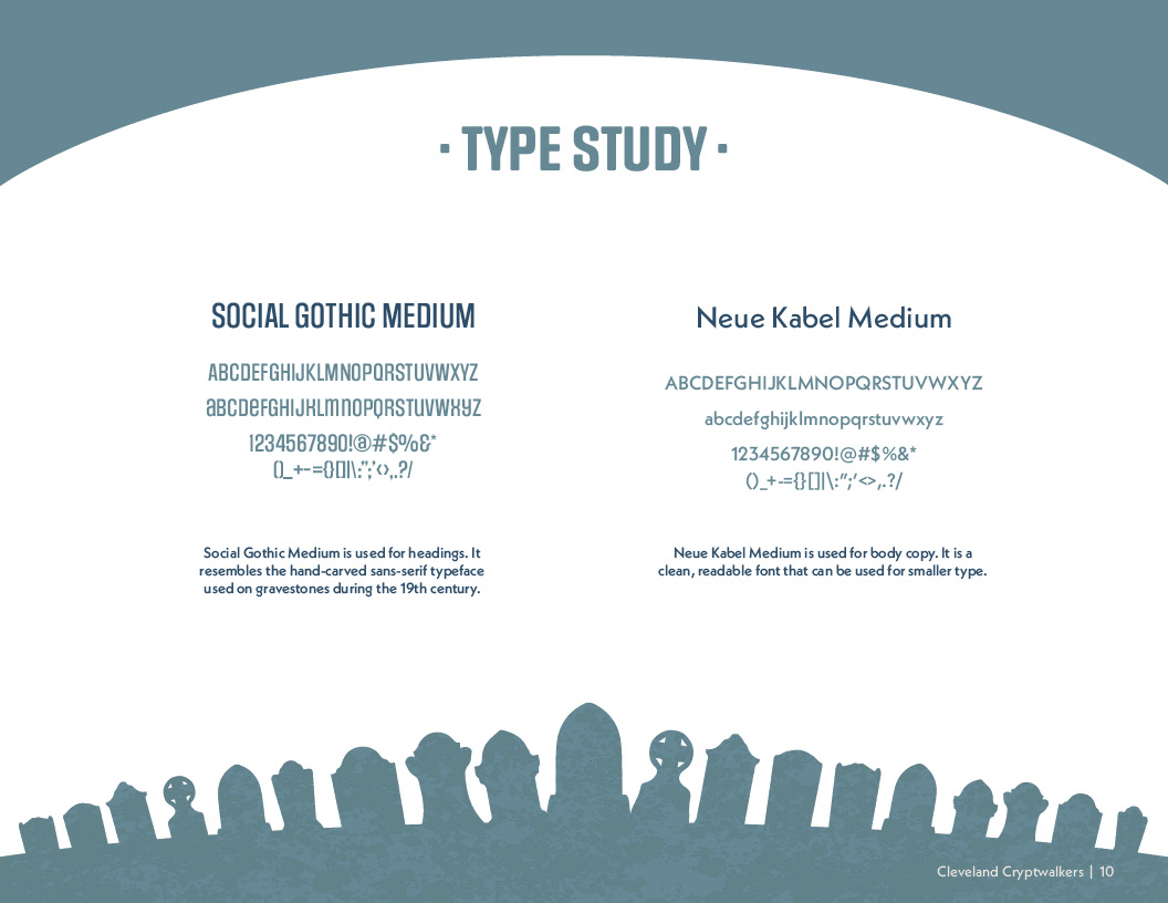
somber beauty. The typeface Social Gothic Medium is used for headings. It resembles the
hand-carved sans-serif typeface used on gravestones during the 19th century.
Neue
Kabel Medium is used for body copy. It is a clean, readable font that can be used for
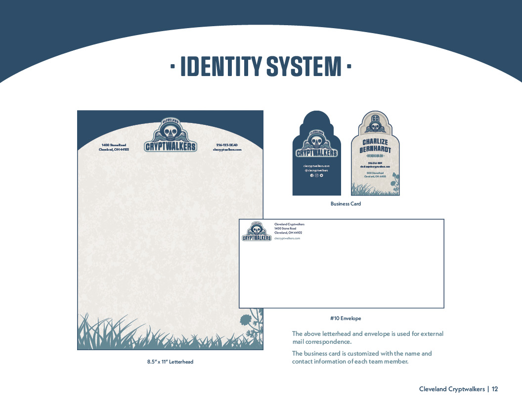
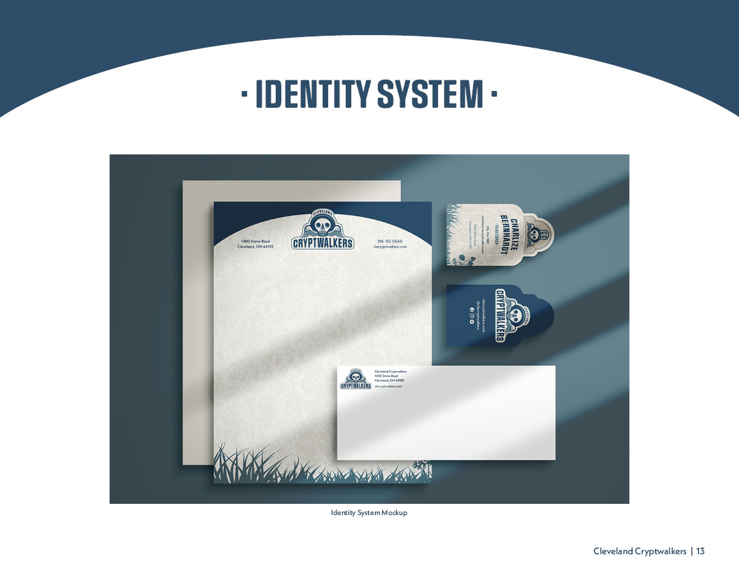
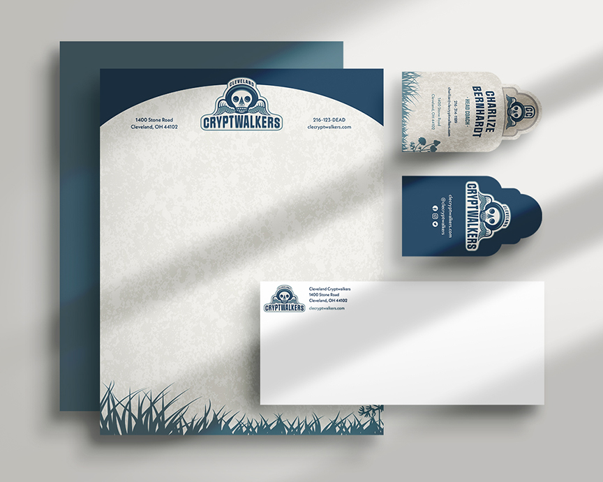
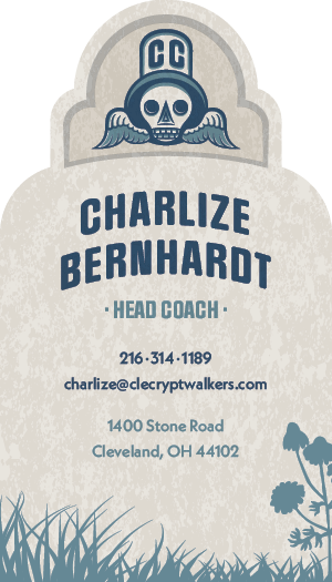
smaller type. The business card resembles a gravestone, featuring the memento mori symbol, the
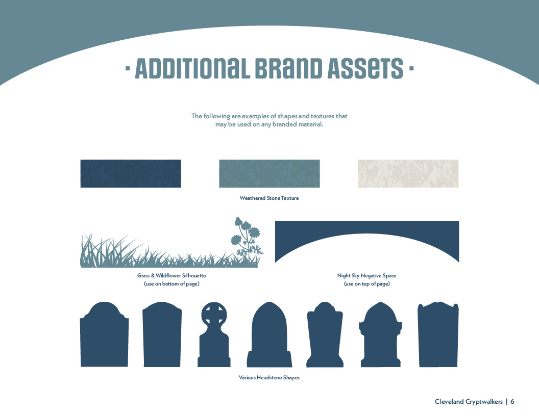
CC worn stone texture, the team member’s name and information, and the CC grass silhouette at
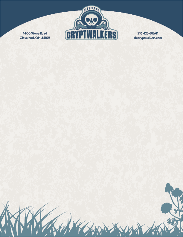
the bottom. The letterhead also resembles a gravestone, but it is much simpler, with the logo
and team info at the top, the grass silhouette at the bottom, and a subtle version of the worn
stone motif with ample space to print a letter. The #10 envelope shows the logo and address in
the corner in the CC colors, leaving space for postage and the receiver’s address. An identity
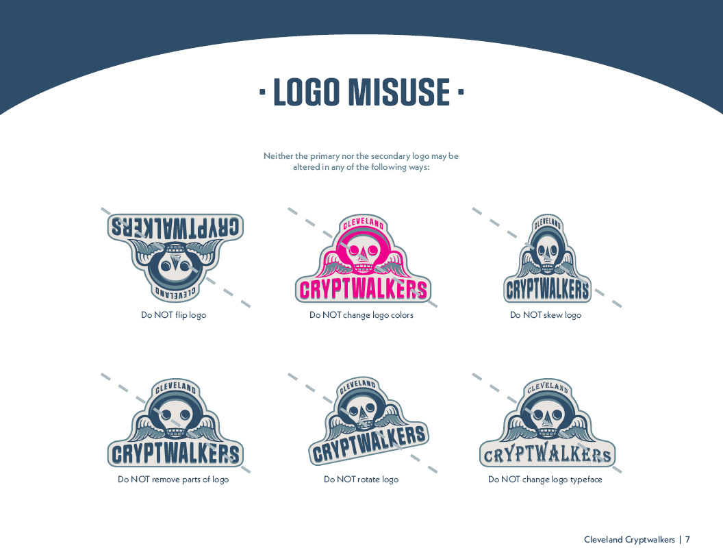
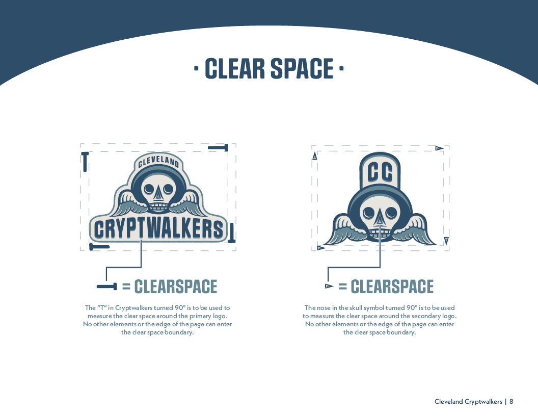
guideline was developed, explaining and showing visual examples of the standards for CC’s
branding, including a brand story, logo misuse, clear space, color studies, and
type studies.
LOGOS
Primary Logo

Secondary Logo
IDENTITY SYSTEM
Business Card Front
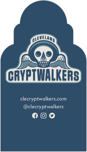
Business Card Back
Letterhead

#10 Envelope
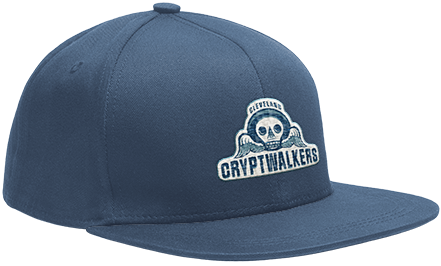
Baseball Cap
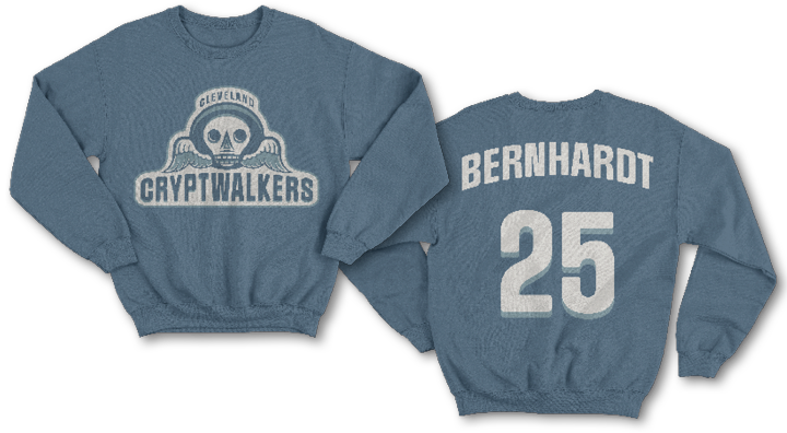
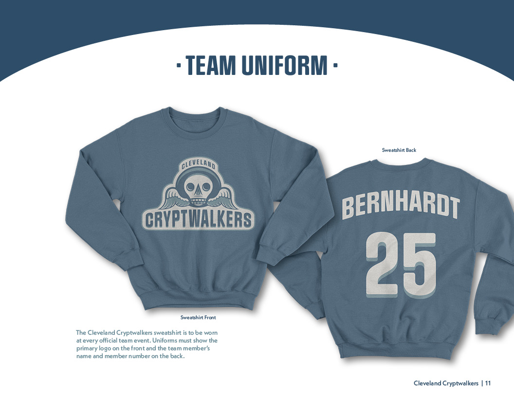
Sweatshirt
IDENTITY GUIDE