HISTORY OF THE LETTER Z
POSTER SERIES SPRING 2022
DESCRIPTION
This is a series of three, 10"x10" posters illustrating the history of the letter Z. The
headline, “What’s the buzz with Z?”, is inspired by the buzzing sound the letter Z makes. The
paragraph featured on each poster is written with as many words as possible that contain the
letter z to remind the reader of the importance of the letter in language. It is based on
research that references the Phoenician origins of the letter Z, its erasure in Roman Latin, its
resurgence in American English, and how it is pronounced around the world.
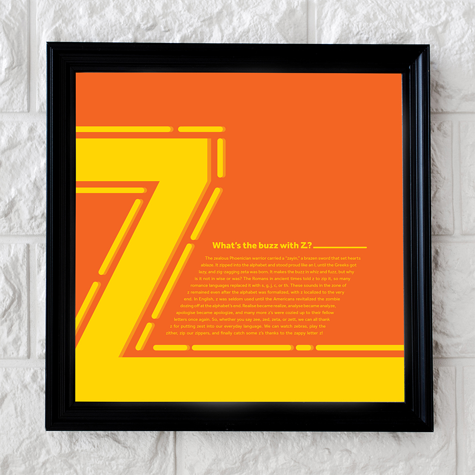
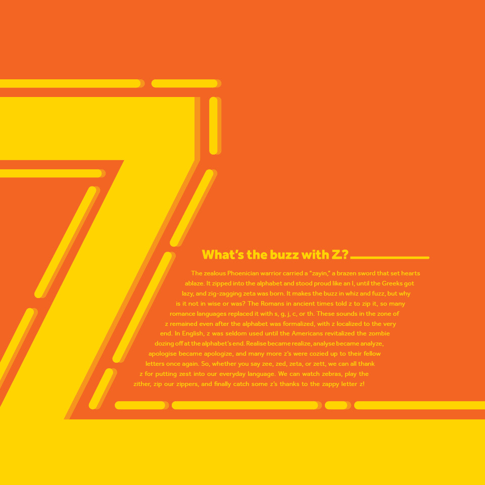
The first poster in the series focuses on the Z symbol. The large Z on the left side of the with
lines following the shape of the symbol to show the angular movement of the form. The small body
copy and the large amount of white space to the right of the composition create hierarchy that
draws the viewer’s eye to the large Z first.
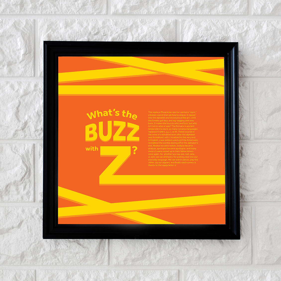
The second poster focuses on the headline and plays on the concept of “the buzz,” or the news,
getting around. This is shown by the line extending from the bottom of the Z going off the page
and appearing to wrap around the top and bottom of the page several times, symbolizing the way
the information about Z is moving.
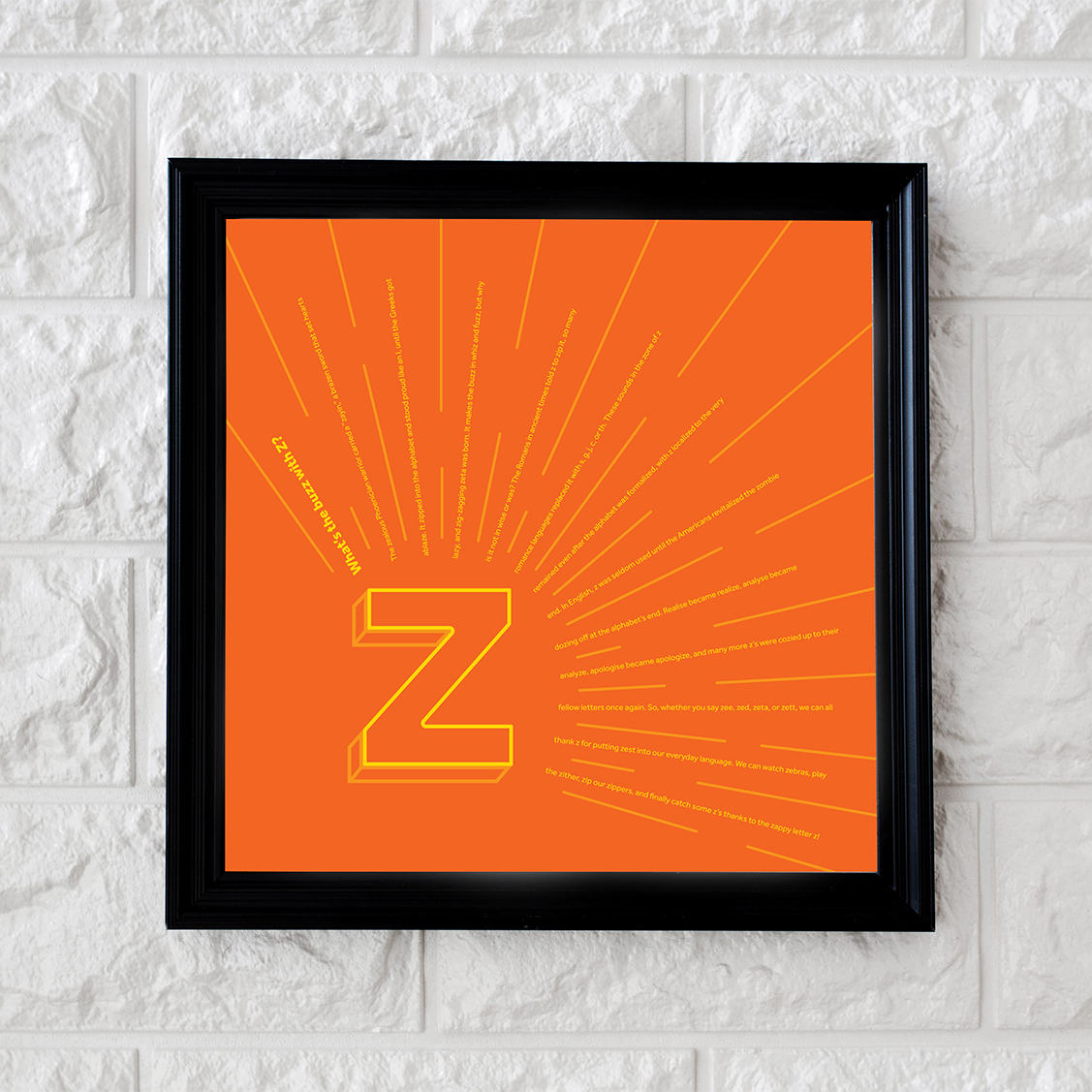
The focus of the third poster is the body copy. This composition also plays with “the buzz;” the
outlined Z in the bottom left corner looks like it is shouting out each line of body copy. The
orange lines between the lines of copy illustrates that what is being said is a loud shout. The
Z is an outline to reduce focus on the Z shape to let the viewer more easily focus on the body
copy instead of the letter Z itself.
The font in the posters is Effra. It is a
neo-grotesque typeface with many weights that is very easy to read in body copy and works well
in headlines. It also has a robust and angular Z character.
The yellow and orange color scheme conveys simplicity, warmth, and excitement. Yellow is
associated with the “buzz” sound and provides a bright, electric focal point in each poster. The
deep orange has contrast against the brighter yellow, and the tangerine color is used to create
a shadow effect.
FINAL DESIGNS
Symbol Focus
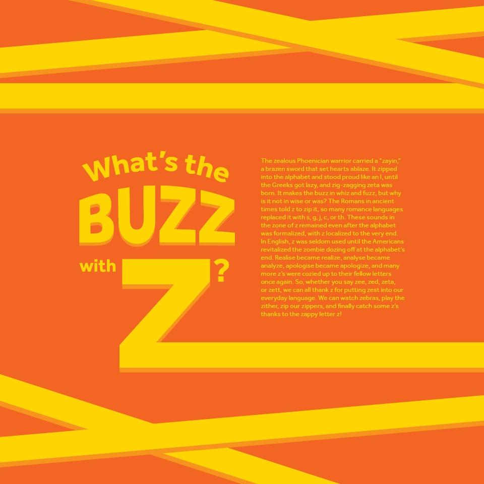
Headline Focus

Body Copy Focus