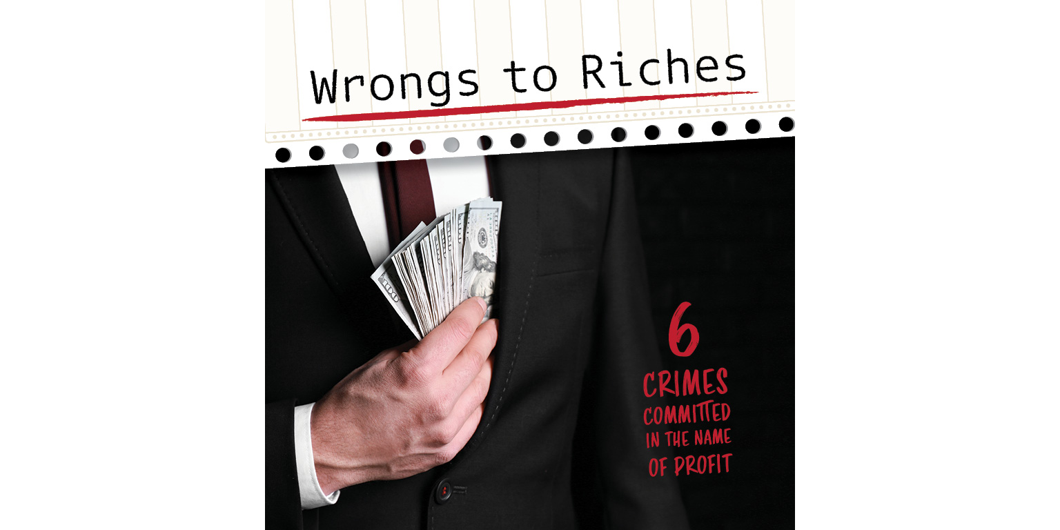
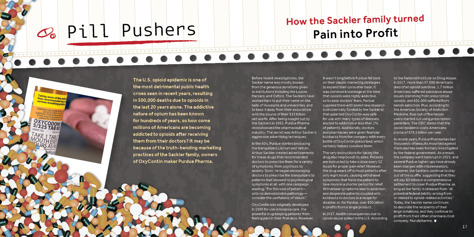
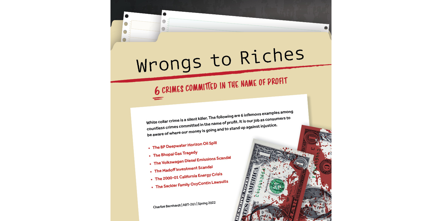
WRONGS TO RICHES
LONG-FORM BROCHURE SPRING 2022
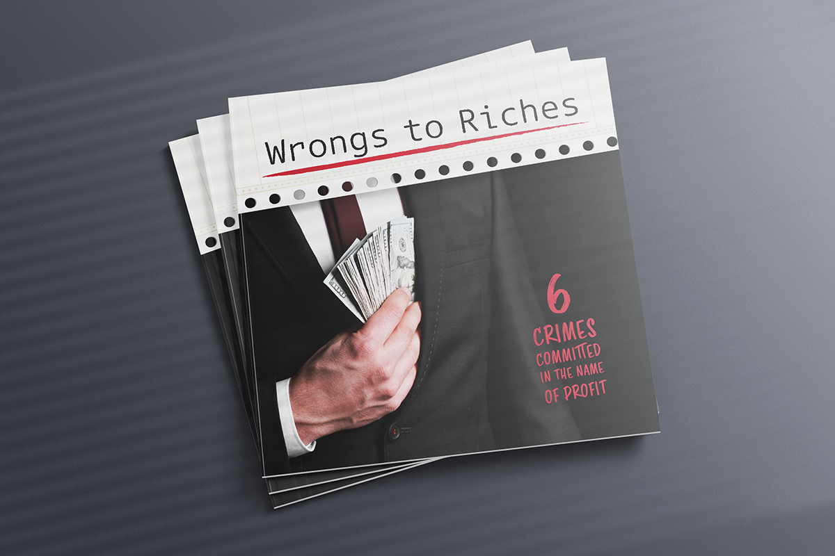
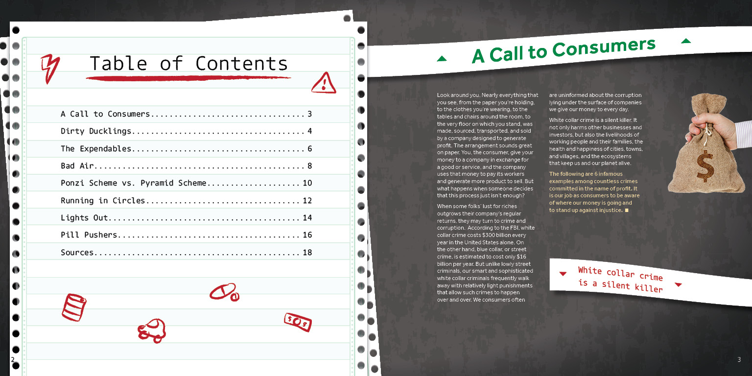
DESCRIPTION
White-collar crime is an often-overlooked category of true crime that affects consumer’s daily
lives much more than we realize. This brochure, “Wrongs to Riches”, sheds light on this topic
while explaining six of the most infamous white-collar crimes in recent history. The piece is a
saddle-stitched long-form brochure with 20 pages of original research-supported copy, graphs and
diagrams, direct quotes, numerous photographs, custom illustrations, and visual aids. This
project required knowledge of booklet stitching and printing, typography and typesetting in
InDesign, and the fundamentals of layout design to produce.
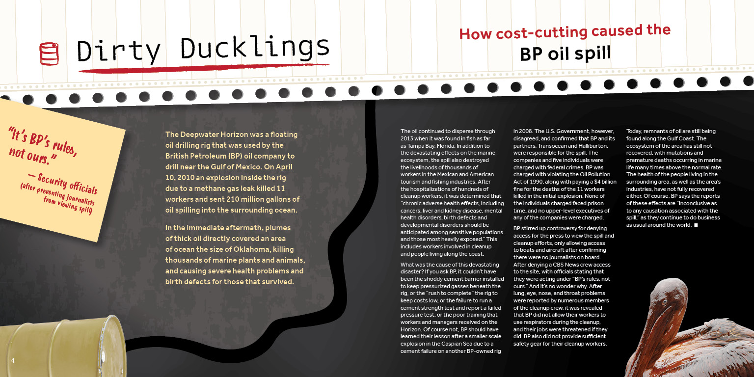
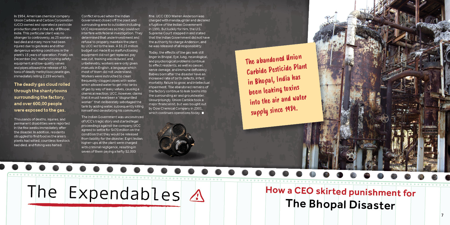
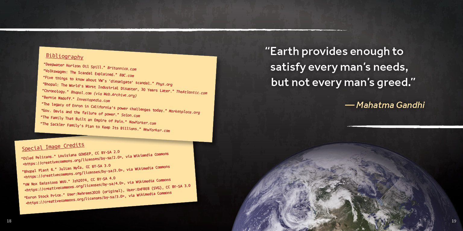
The imagery is inspired by office stationery and true crime evidence boards. They are placed in
a layered fashion with textures and shadows for a 3-dimensional feel. One of the main pieces of
imagery is continuous feed paper, lined paper used for fast printing that was most common
through the late 20th century. Matching the business and true crime feel, other bits of imagery
are inspired by ticker tape, Post-it notes, and Polaroid photographs. Various images from
royalty-free sources create an emotional impact, such as the
oiled pelican photo. Others are heavily manipulated using Photoshop to use as decoration and
assist with page layout, like the scattered pills photo.
The colors are derived from the office supplies that inspired the imagery, and fit in with the
dark and dramatic mood of the brochure. In addition to the grungy texture, the gray background
color sets a dark tone and the red adds drama. The red and green are inspired by the colors used
to indicate loss and profit in the stock market, which frequently crops up in the brochure’s
content. Like the colors, the typefaces are inspired by those found in an office and contribute
to a dark and dramatic tone. Dico Typewriter, used for headings, is a font that resembles type
that was printed by old computers, and it also looks grimy and worn. Smoothy, used for callouts,
was chosen for its resemblance to handwriting as if someone was scribbling notes with a marker.
Effra is a clean and easily readable sans-serif typeface perfect for body copy.
FINAL DESIGNS